Quiksilver, Redesigning the mobile shopping experience for social-first users

ROLE
The Challenge
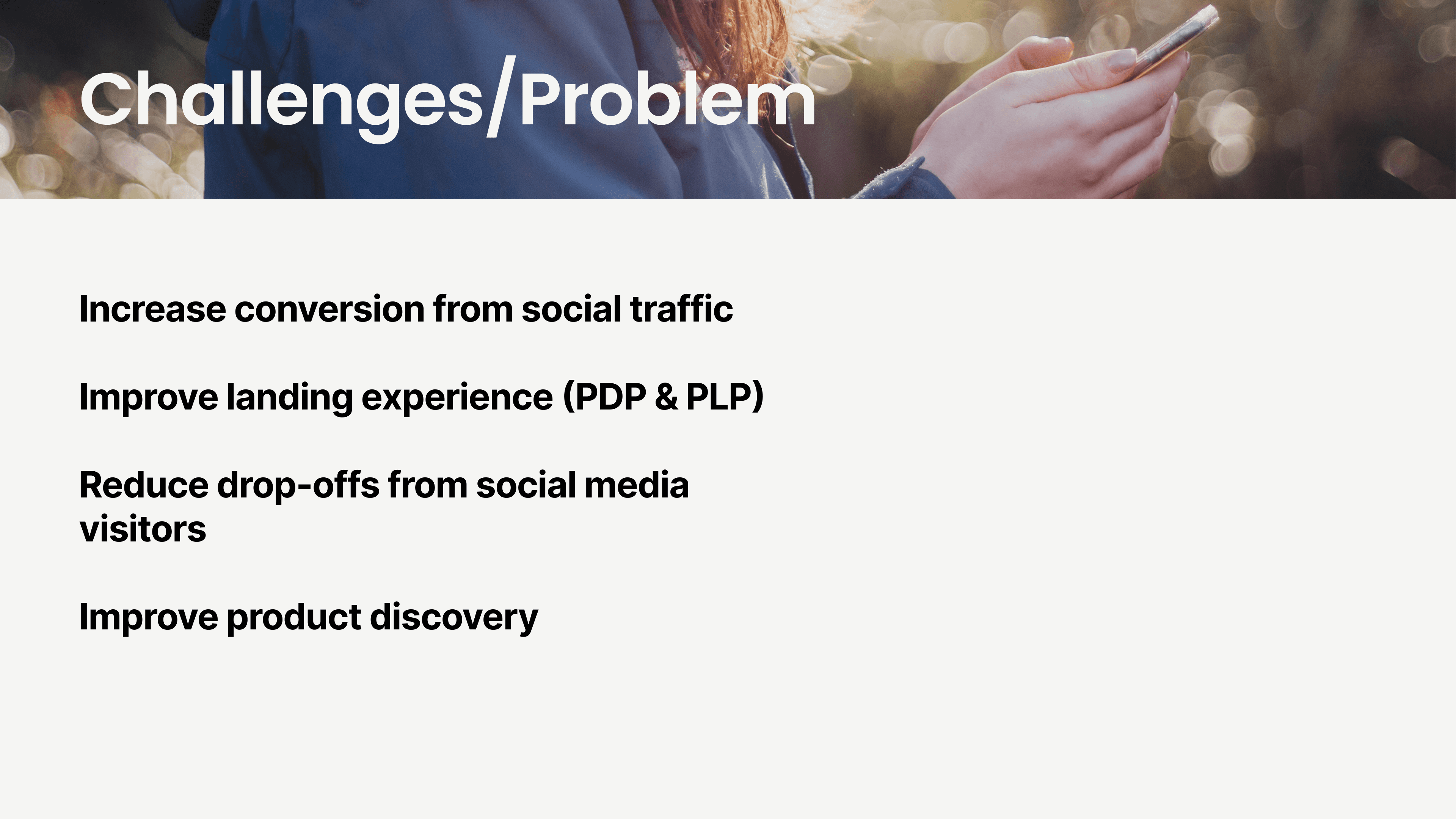
Quiksilver is more than a clothing brand - It's a lifestyle built on surf culture and board sports, with a strong identity since 1969. Social media drives 17.3% of their traffic but only 4.6% of orders - A conversion rate of 0.46%. Users arrive inspired from Instagram and leave without buying. We were brought in to understand that gap and close it through research and design.
Stakeholder Interview
We kicked off the project with a 30-minute interview with Mathieu Capoën, EMEA Product Manager at Boardriders. He confirmed the data: social traffic was their second-largest source of visits but ranked sixth for actual orders. The project came with rich quantitative data - analytics, conversion flows, and post-purchase surveys. What was missing was the qualitative layer: the human stories behind the numbers. That became our focus.
Research
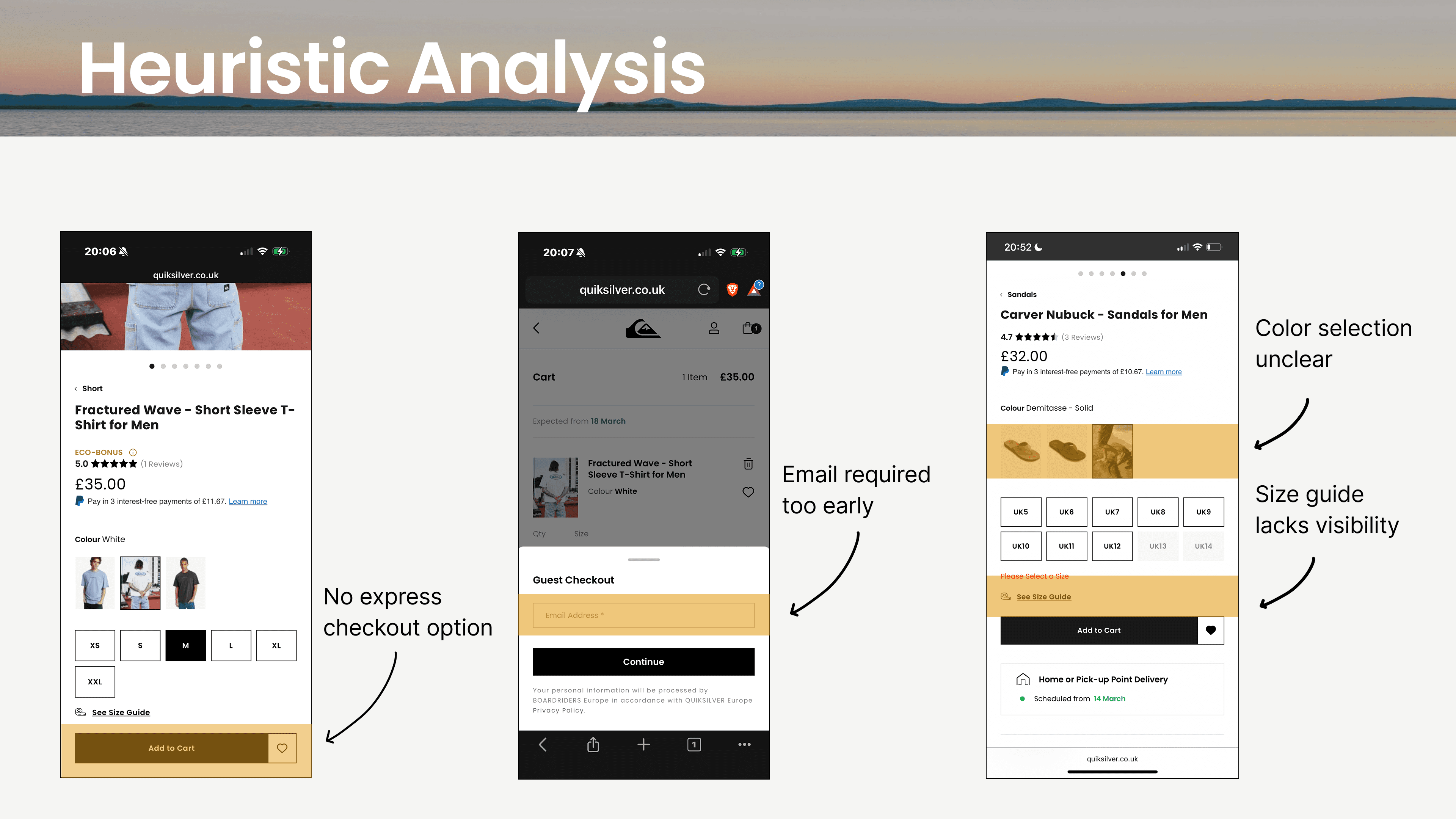
We started with a heuristic audit of the existing mobile experience. Key actions like the size guide and guest checkout lacked visual weight, there was no express payment, and shipping costs appeared too late. On mobile, for an impulse buyer, every one of those moments is a reason to leave.
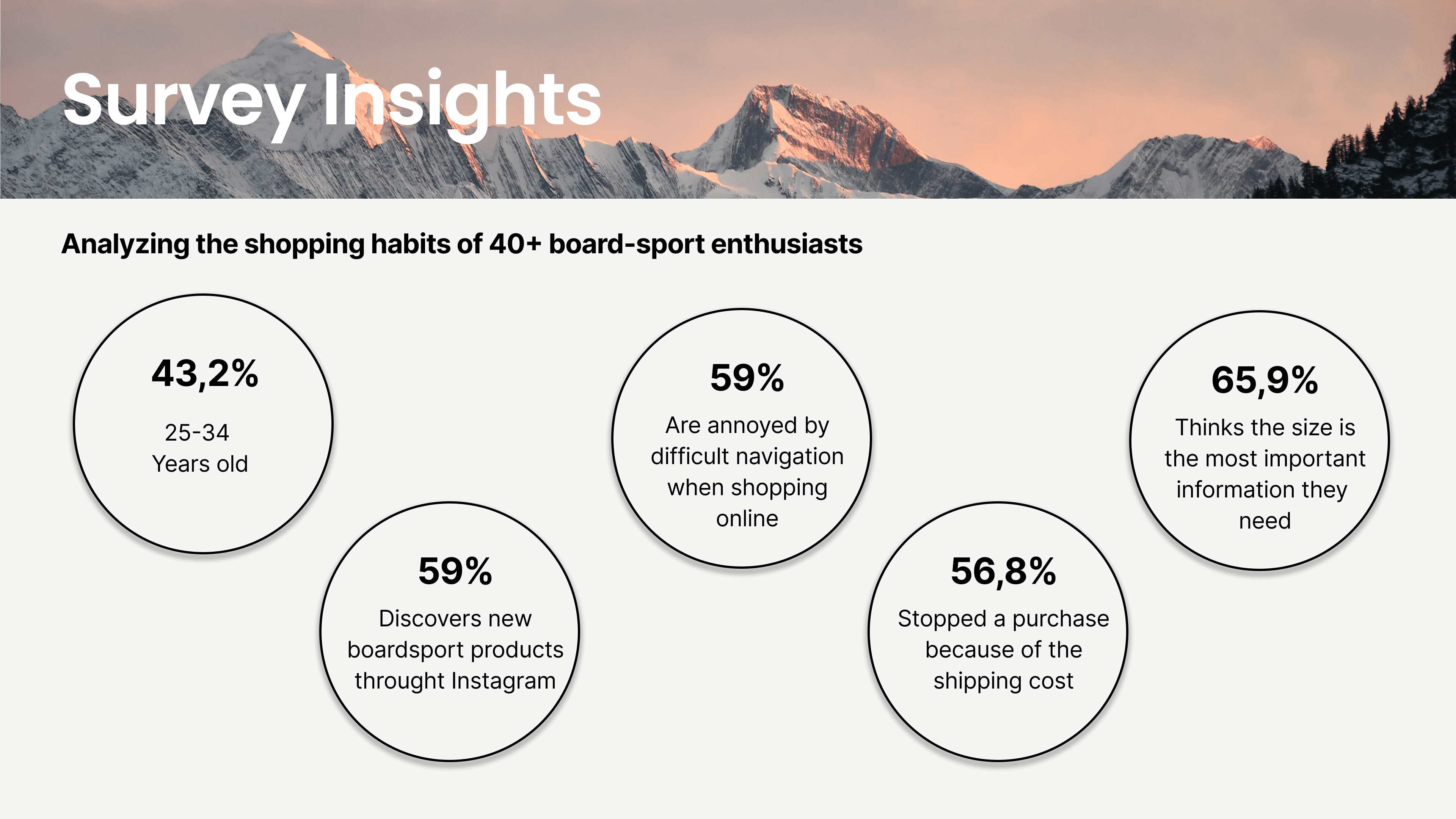
We then surveyed 40+ board-sport enthusiasts. Instagram was the primary discovery channel for most, 65.9% said size information was the most important factor in deciding to buy, and 56.8% had abandoned a purchase because of shipping costs.
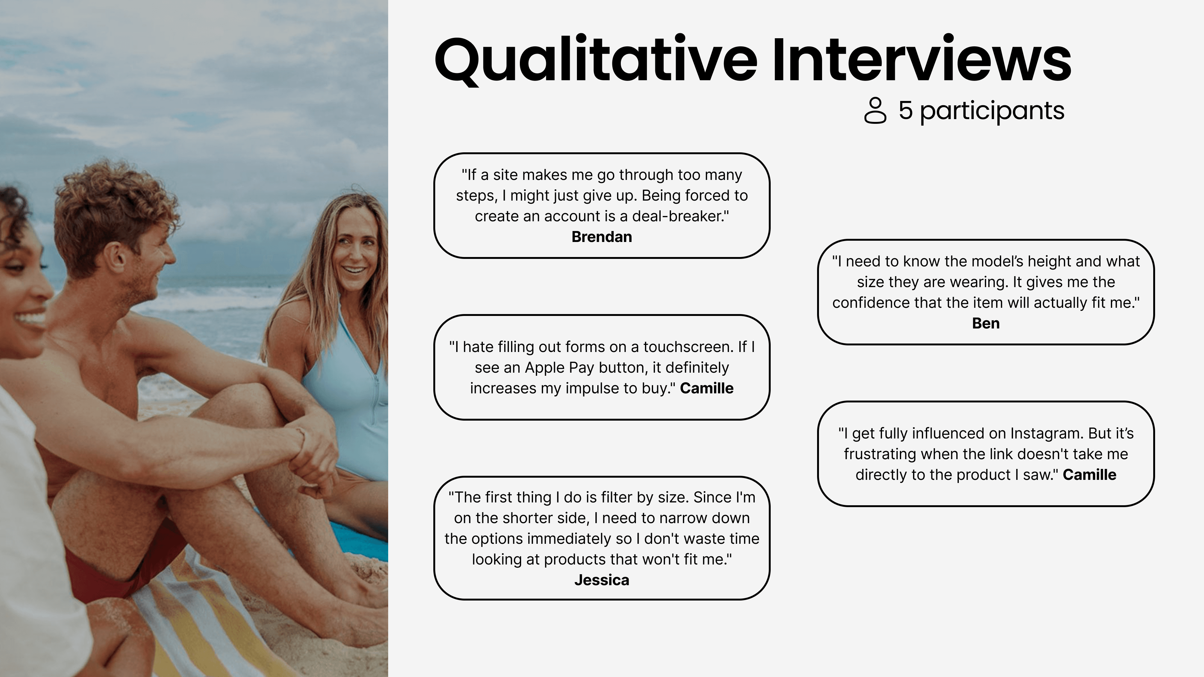
5 qualitative interviews revealed two consistent themes: too many steps - especially forced account creation - and not enough confidence to commit to a size.
"Don't make me think too much."
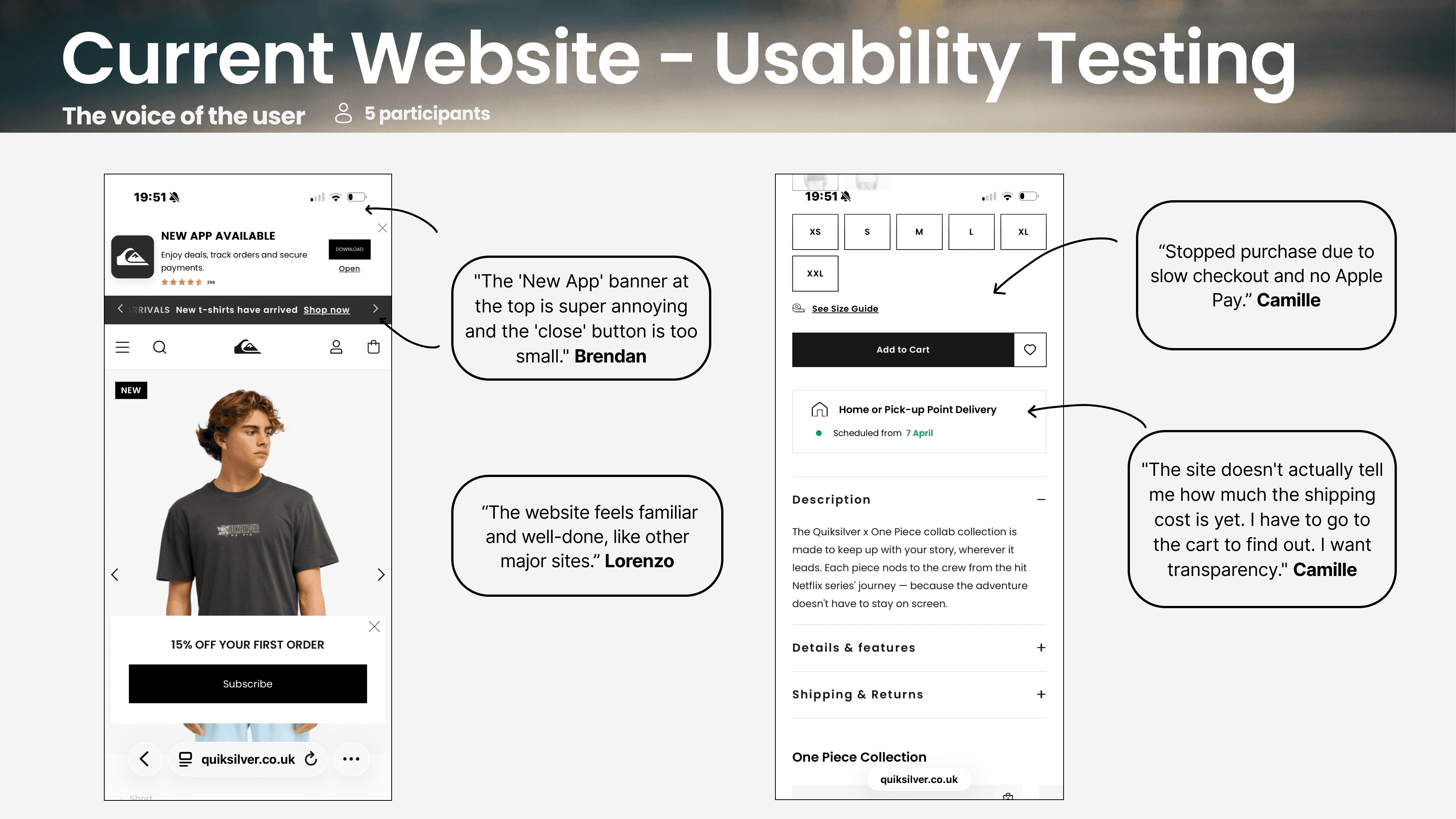
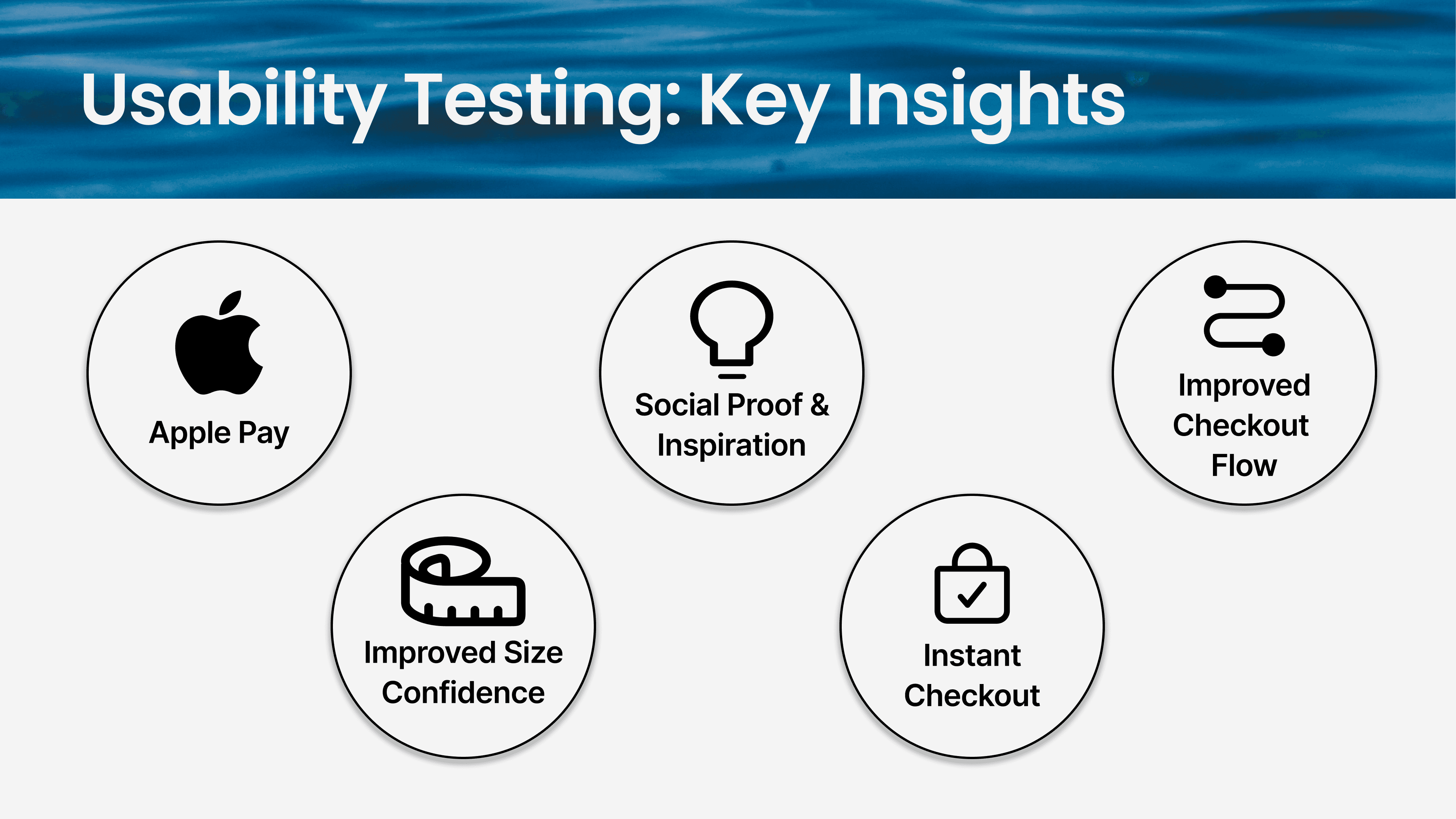
We tested the original experience with 5 real users. Shipping costs appeared too late, forms were frustrating on mobile, and guest checkout was hard to find. Users knew what they wanted: speed, simplicity, and confidence.
Problem Statement
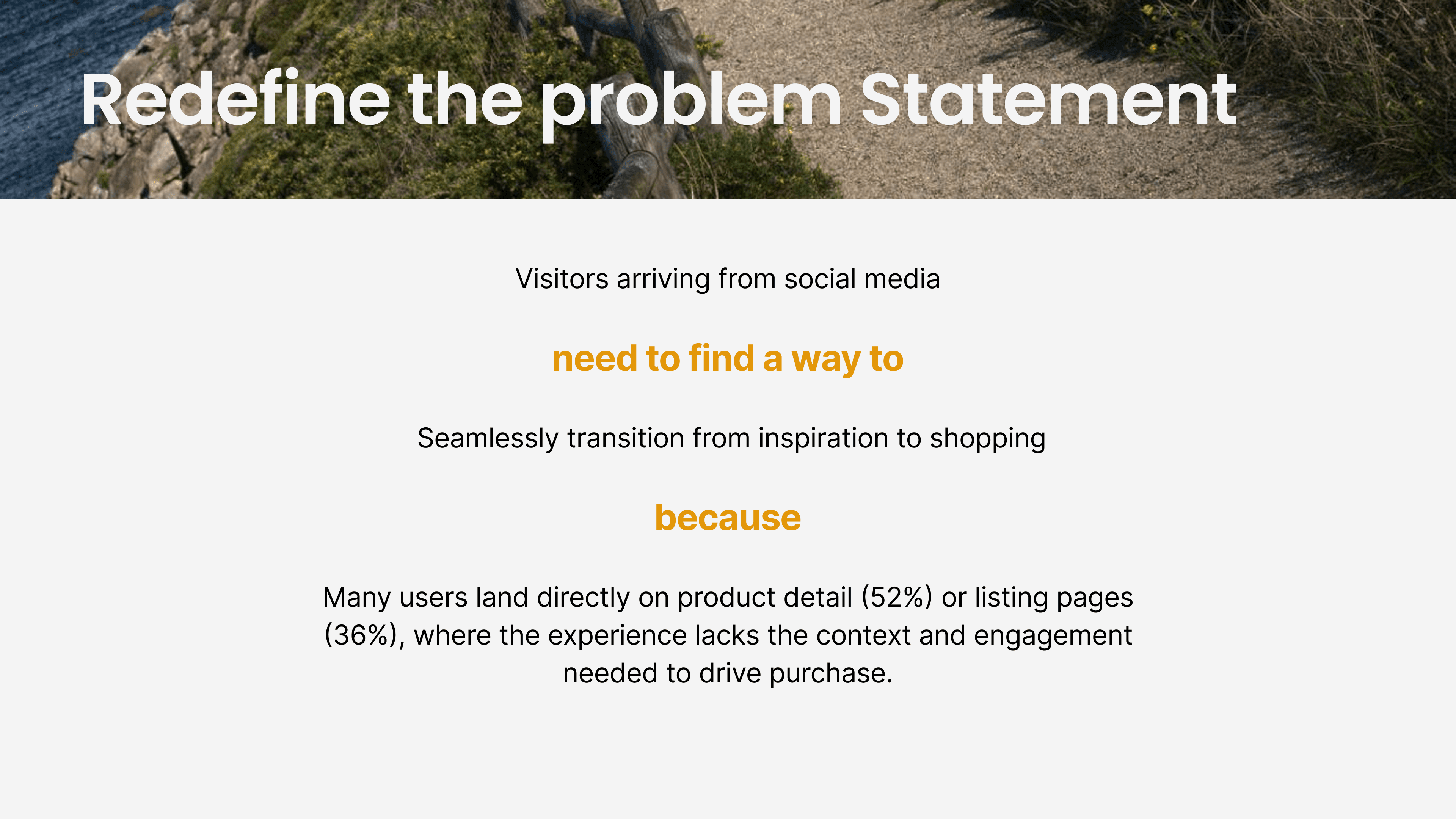
Define
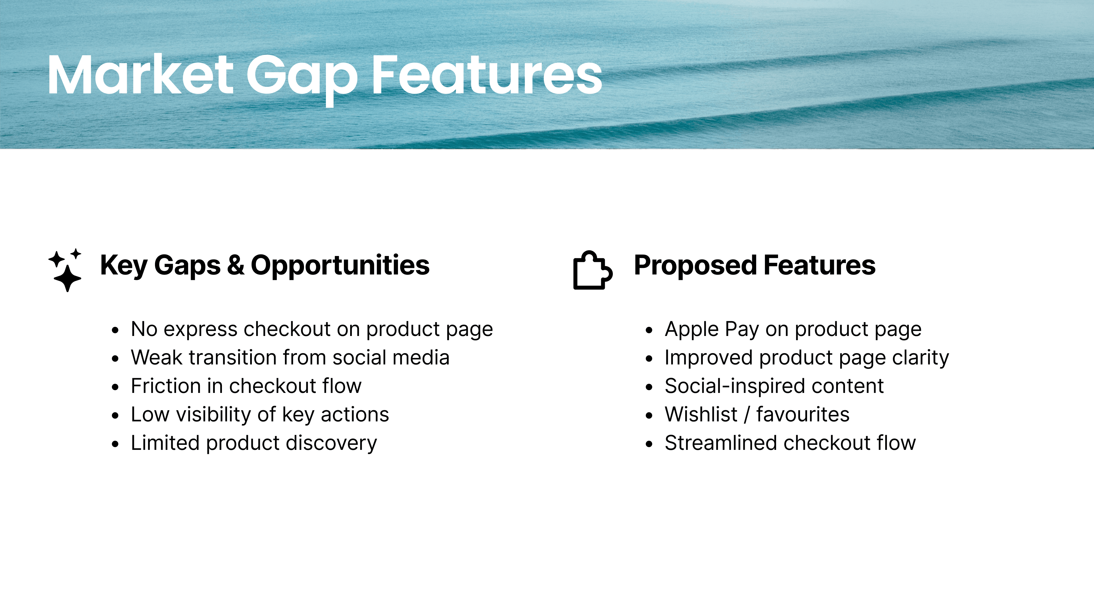
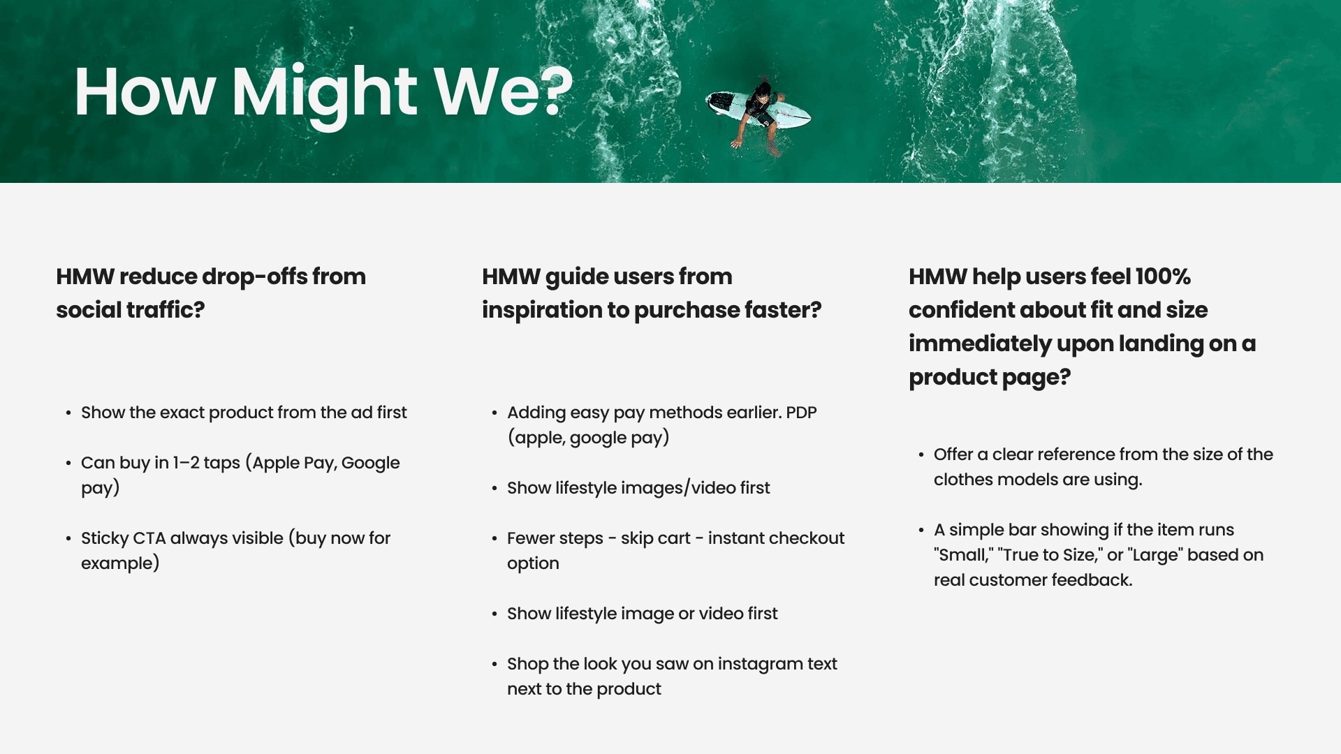
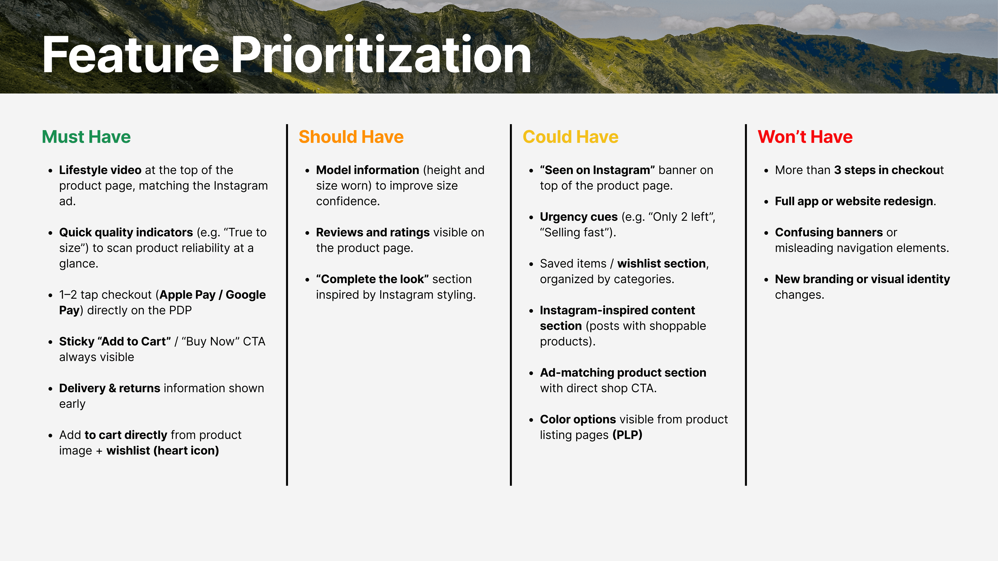
After mapping competitor experiences from brands like Vans, Rip Curl, and O'Neill, one thing was clear - faster checkout and express payment had become the standard. Quiksilver had room for improvements. We ran HMW exercises and used MoSCoW to focus on what mattered most. Our MVP came down to three principles: speed, confidence, and continuity.

User Persona
Meet Miguel a 32-year-old surfer based in Lisbon. He discovers products through Instagram, shops on mobile, and has no patience for friction. He doesn't browse. He sees, he wants, he (sometimes) buys.

Design & Testing
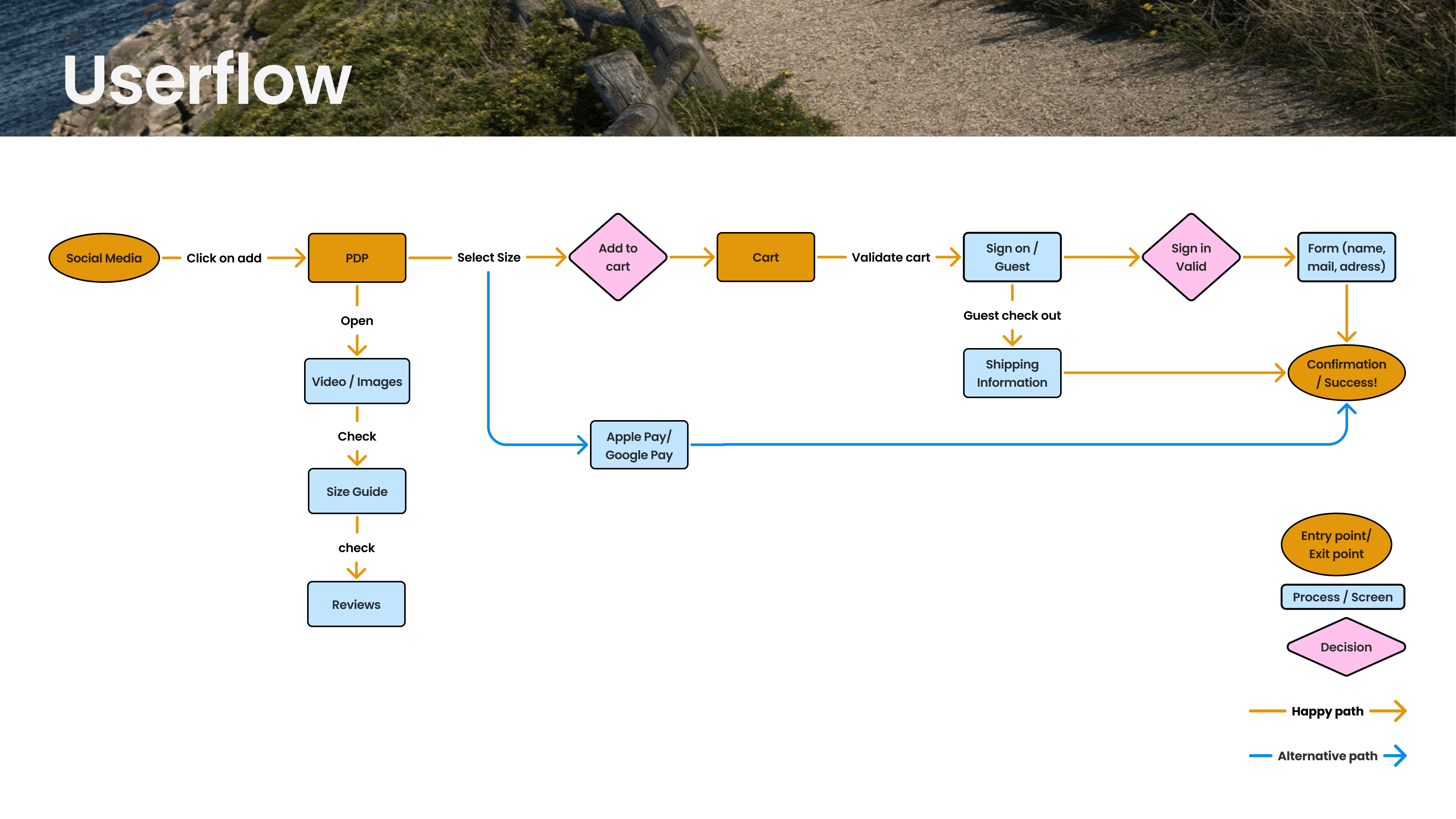
We designed two checkout flows - express for impulse buyers, standard for considered buyers - and tested them across two rounds of prototyping.
Express Flow - Instagram ad → Product page → Size guide → Apple Pay → Done.
Standard Flow - Product page → Cart → Guest checkout → Shipping → Payment → Confirmation.
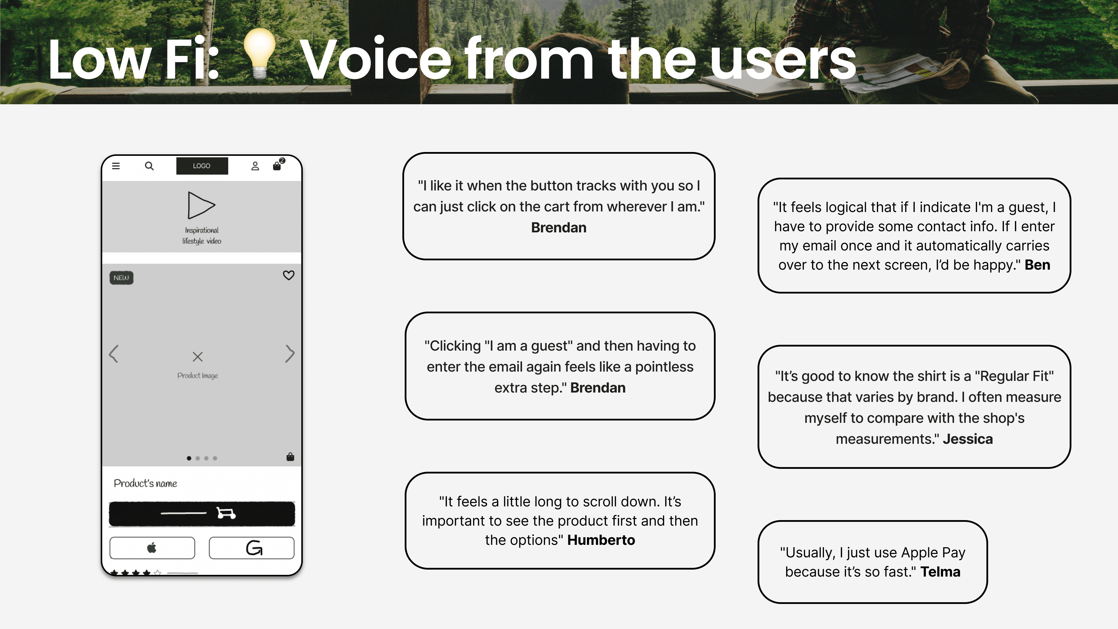
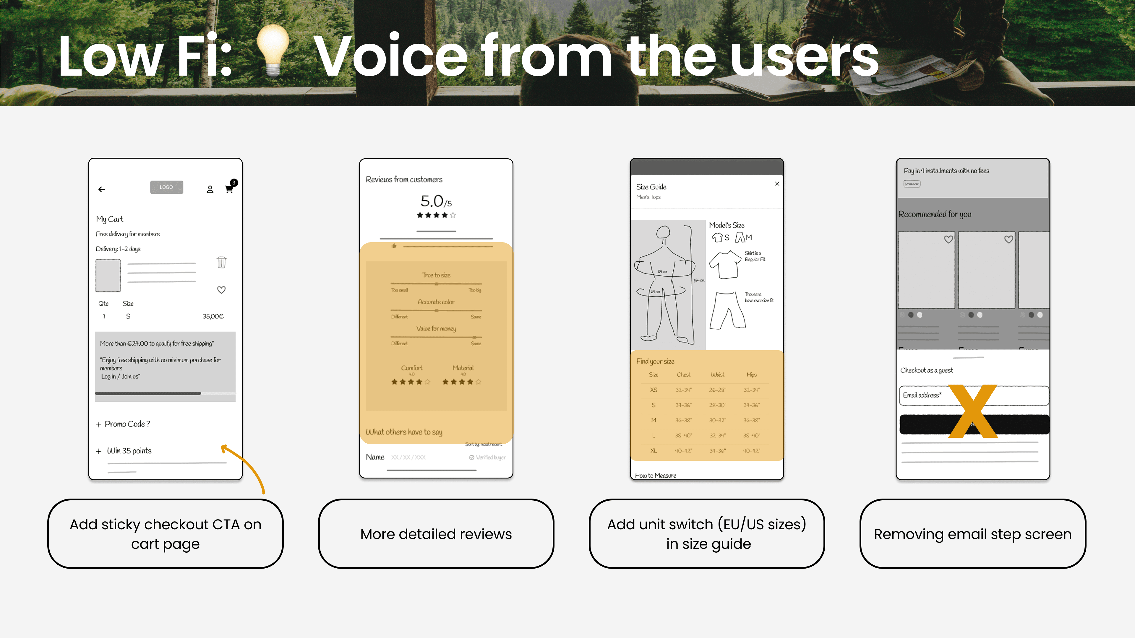
Lo-fi testing showed the sticky CTA needed more weight, guest checkout was still too easy to miss, and the size guide felt like an interruption rather than a tool. We fixed all three before moving to mid-fi.
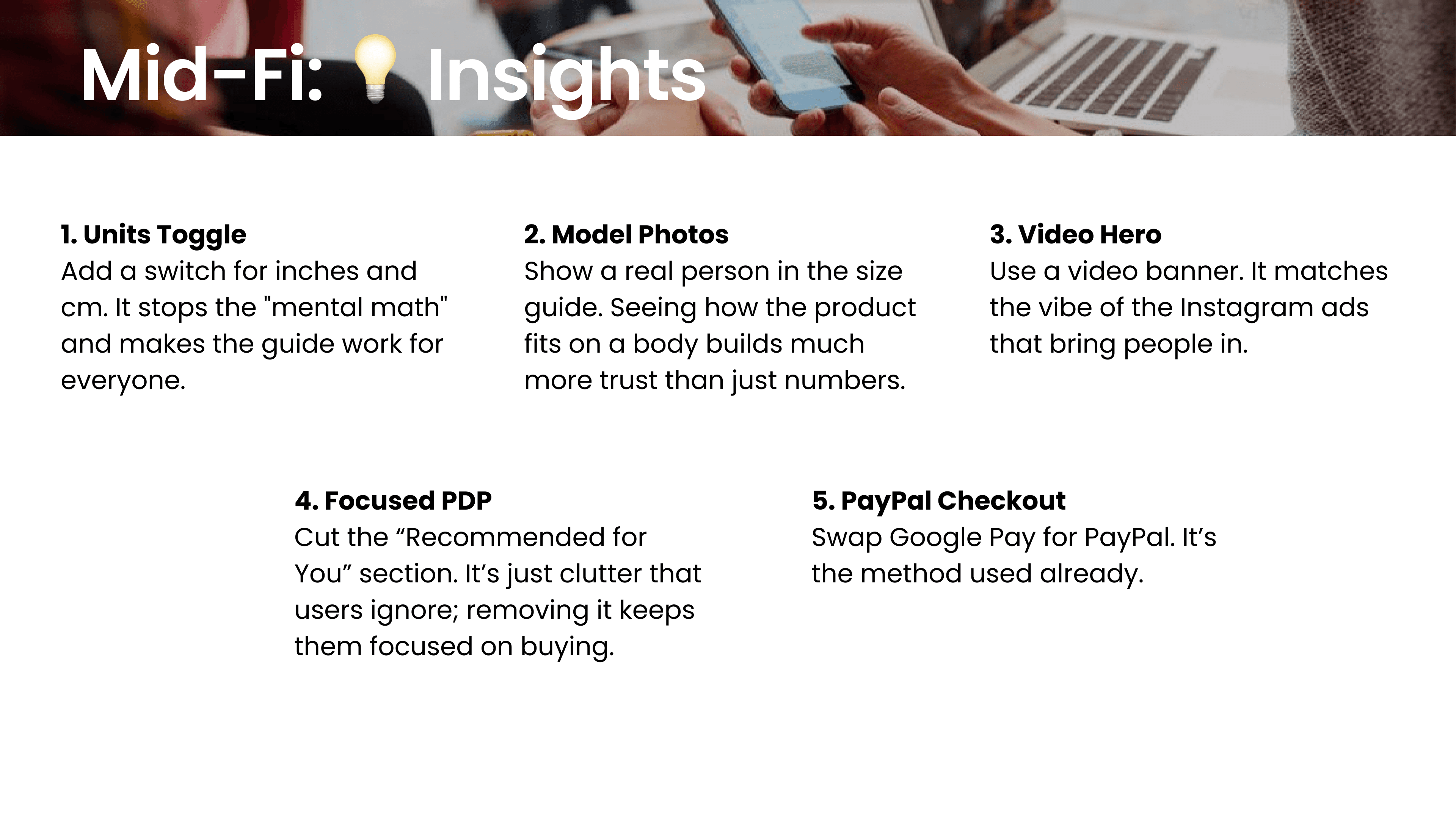
Mid-fi testing confirmed the improvements worked. Users felt more confident with the redesigned size guide, responded positively to Apple Pay floating throughout the flow.


Final Design
The same experience, two ways to complete it - a fast express path for impulse buyers, and a standard path for those who want to review before committing.
Express Flow
For the impulse buyer. From Instagram ad to purchase in under a minute - no account, no form, no friction.
Standard Flow
For the considered buyer. The familiar checkout experience, but with all the friction removed - guest checkout visible, no duplicate fields.
What We Learned
Inspiration continuity is a conversion strategy. Users don't just want fast checkout - they want to stay in the feeling that made them tap the ad in the first place.
Size confidence matters more than speed. Even the most impatient users pause at size selection. Making that moment feel safe directly reduces drop-offs.
Small friction compounds fast on mobile. Hidden buttons, duplicate fields - together they make the experience feel effortful, and effort kills impulse.